|
Facts & Trends™ Help Page |
Close Page |
| System Requirements You do not need to install any special software to use Facts & Trends™. However, there are some important ways you can prepare your computer to ensure a smooth working experience. Check your Internet browser For best results, access Facts & Trends™ using Microsoft Internet Explorer® browser, version 6.0 or higher. Internet explorer is available as a FREE download from http://www.microsoft.com. If you connect to the Internet through AOL® or another Internet Service Provider, once you are online, simply minimize the AOL window, and then open the Internet Explorer browser. Turn-off all pop-up blockers Several features in Facts & Trends™ use a pop-up window. Make sure that all pop-up blockers are turned-off. Check your screen resolution Follow these easy steps to make sure your screen resolution is set to at least 1024 x 768 pixels:
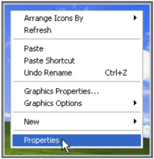 2. Click the Settings tab. 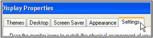 3. Locate the Screen resolution setting. If it is lower than 1024x768, change it to 1024x768 (a higher resolution is also okay). Then, click OK to save the settings. 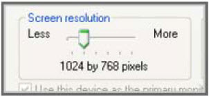 |
Close Page
Back to Facts & Trends™ Features
Back to top
![]()
| When does Trendgraphix update reports with new data? Trendgraphix releases new data for your reports no later than the 10th of each month, for the previous month's data. To help you understand how Trendgraphix processes your MLS data every month, here are the steps we take to generate to ensure your reports are accurate:
2. The off market listing data is downloaded at the 4th or 5th of the following month (to capture the late reporting listings). 3. The data for item #1 and #2 are processed (in programming) for approx. 5-6 bussines days. During this time we perform our Data Validation Process, which includes manually cross-checking the data for anomalies such as typos made during the entry into MLS. An example of such an anomaly would be a $250,000 listing that is entered into the system as a sale at $2,500,000, due to a key-stroke error. |
Close Page
Back to Facts & Trends™ Features
Back to top
![]()
| Facts & Trends™ Features *Click on a section of the Facts & Trends™ report below to get help on that feature. |
 |
|
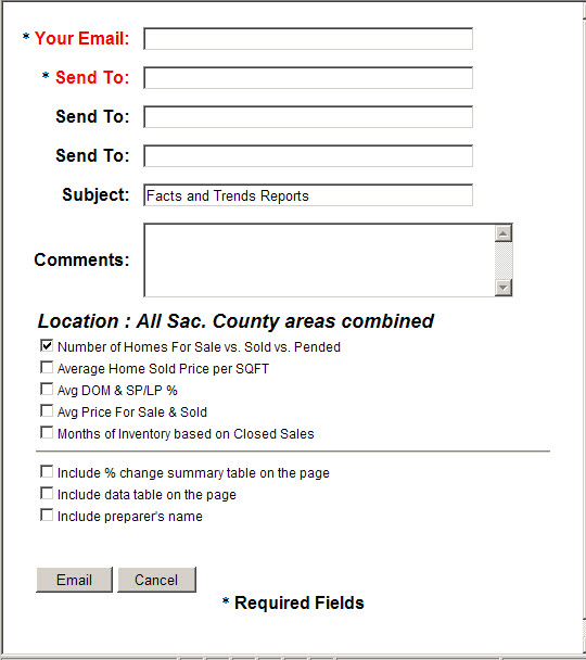
After clicking the Email button, the following email dialog box appears on the screen.
This feature can be used to send report/s via email to clients. The sender must fill out several required fields (such as the sender email address, the receiver email address) and optional fields (such as the subject of the email, comments). The sender can send email to multiple receivers at a time by filling out the receivers email address in the Send to field. The sender can customize the content of the email by selecting which report/s that will be included, including % change summary table and/or data table, and showing the preparer name in the email. Once the "Email" button is clicked, the email is sent to the recipient/s. The sender will get a confirmation email if the recipient/s open or read it. Close Page
Back to Facts & Trends™ Features
Back to top
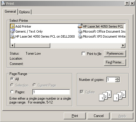
After clicking the Print button, the following dialog box appears on the screen.
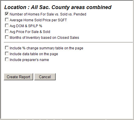
This feature is used to print one or more reports. Customize the printed report by selecting which report/s that will be included, including % change summary table and/or data table, and showing the preparer name in printed report. Once the "Create Report" button is clicked, the report is compiled and the regular Print dialog box appears on the screen (see below). You can find the printed report in your printer as soon as you have clicked the "Print" button.
How to print graph/s and data table/s? 1. Be sure that all pop-up blockers are turned off. Close Page
Back to Facts & Trends™ Features
Back to top
After clicking the Help button on the Facts & Trends™ report page, this help document appears on the screen. Close Page
Back to Facts & Trends™ Features
Back to top
After clicking the Tutorial button on the Facts & Trends™ report page, the Tutorial window appears on the screen. You can come back to this feature whenever you need more information on how to present this report to your buyer and/or seller clients. Close Page
Back to Facts & Trends™ Features
Back to top
This feature enables you to save the graph to your own computer for various usages, such as for your marketing materials. How to save a graph to include in marketing materials? 1. Be sure that all pop-up blockers are turned off. Close Page
Back to Facts & Trends™ Features
Back to top
The report selection criterias are divided into 2 search categories as follows: Close Page
Back to Facts & Trends™ Features
Back to top
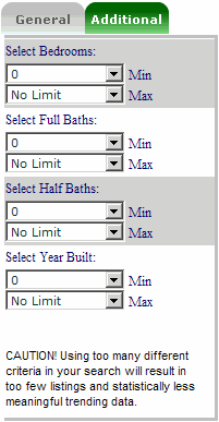
The Additional search covers the additional criterias, such as: bedrooms, full bathrooms, half bathrooms and year built.
Depending on the data availability in your MLS, those field criterias may not all available. If we have not gathered the data for those 4 additional fields, this tab is not available in your report. Close Page
Back to Facts & Trends™ Features
Back to top
This drop down lists provides the list of the available regions. Depending on the report setup, the region list can be the MLSs or counties. The region has to be selected first before selecting other report criterias. Close Page
Back to Facts & Trends™ Features
Back to top
This drop down lists provides locations that are available in the selected region. The location fields differ in each region. Depending on the report setup, the location fields can consist of community, area, city, zip code, etc. The location fields are mutually exclusive. This means you can only select one location field at a time. You cannot select a community and a zip code at the same time. You can select multiple items in the same location field. Close Page
Back to Facts & Trends™ Features
Back to top
This drop down list provides the property types that are available for the report. Select one or more property types you want to include in your report. Close Page
Back to Facts & Trends™ Features
Back to top
This drop down list provides the price range criteria. Select the minimum price and the maximum price for your report. Close Page
Back to Facts & Trends™ Features
Back to top
This drop down list provides the property square footage range criteria. Select the minimum square footage and the maximum square footage for your report. Close Page
Back to Facts & Trends™ Features
Back to top
This drop down list provides the date range choices. There are 2 different date range categories: Close Page
Back to Facts & Trends™ Features
Back to top
This drop down list provides the bedroom range criteria. Select the minimum and maximum number of bedrooms for your report. Close Page
Back to Facts & Trends™ Features
Back to top
This drop down list provides the full bathrooms range criteria. Select the minimum and maximum number of full bathrooms for your report. Close Page
Back to Facts & Trends™ Features
Back to top
This drop down list provides the half bathrooms range criteria. Select the minimum and maximum number of half bathrooms for your report. Note: If your MLS does not differentiate the bathrooms into full and half, then this selection is not available. Close Page
Back to Facts & Trends™ Features
Back to top
This drop down list provides the property year built range criteria. Select the minimum and maximum year built for your report. Close Page
Back to Facts & Trends™ Features
Back to top
After selecting the report criterias in both General and Additional tabs, click the Go button to display the report. Close Page
Back to Facts & Trends™ Features
Back to top
This Main Menu button takes you back to the report main menu that enables you to select other than Facts & Trends™ reports (if available). Close Page
Back to Facts & Trends™ Features
Back to top
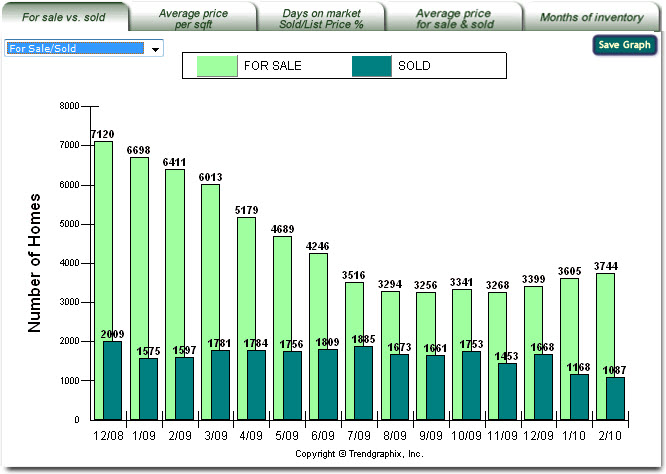
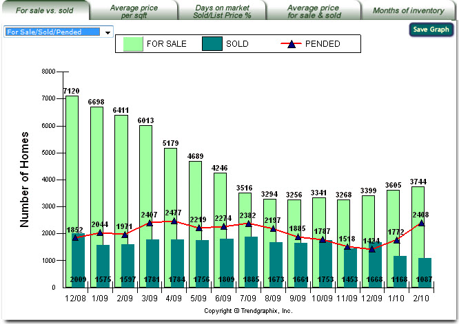
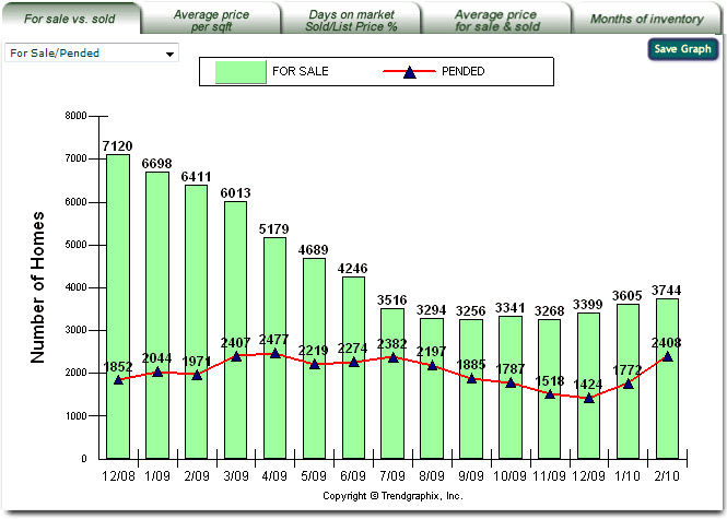
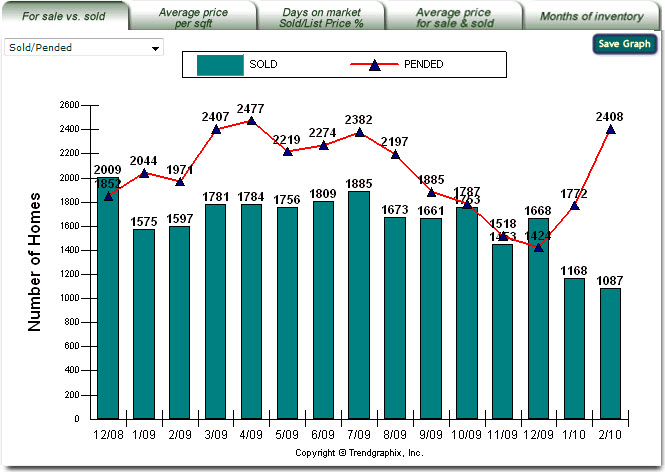
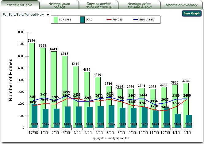
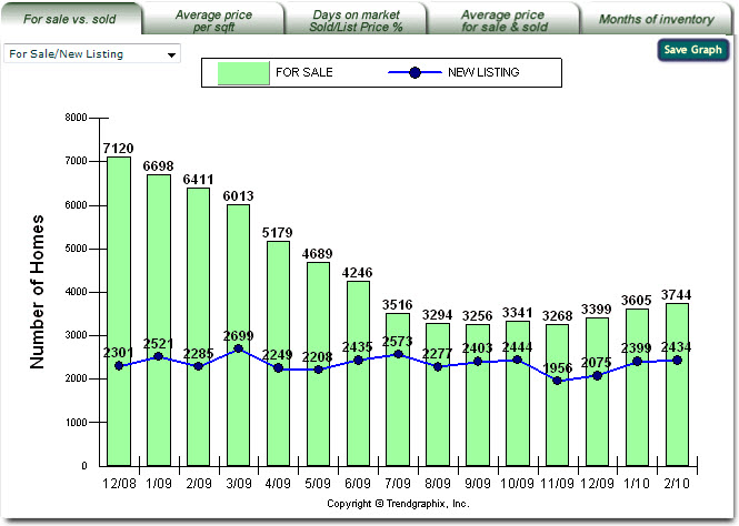
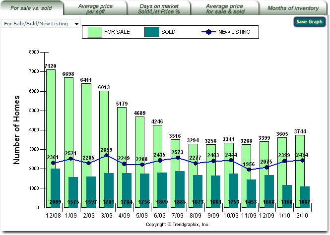
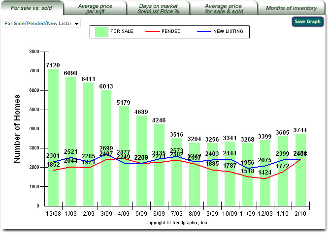
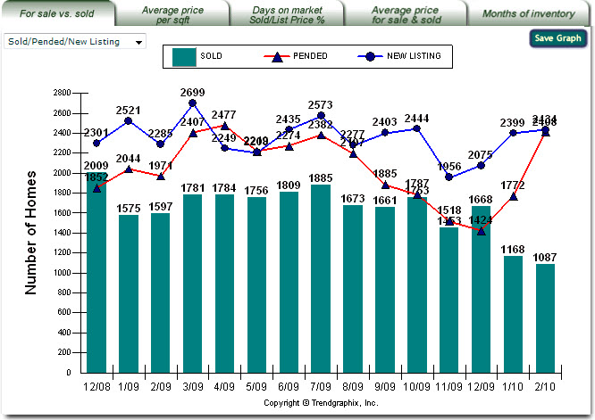
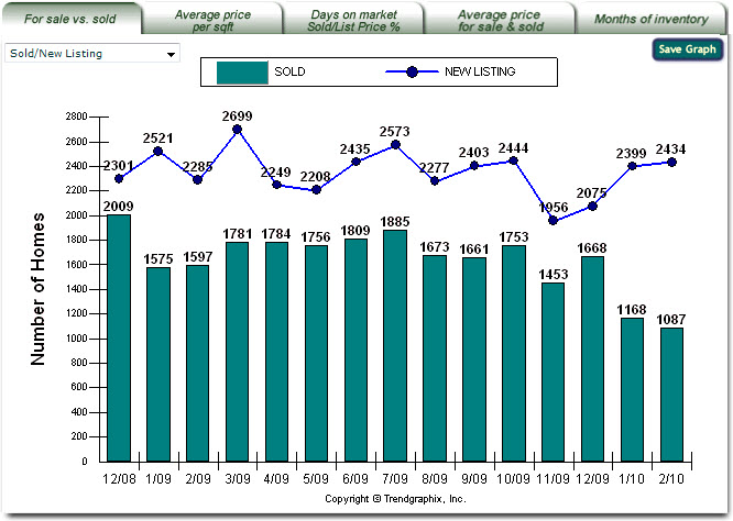
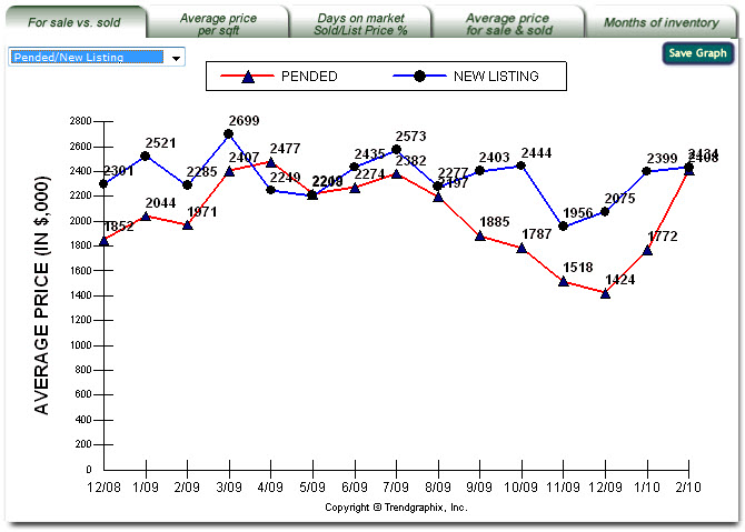
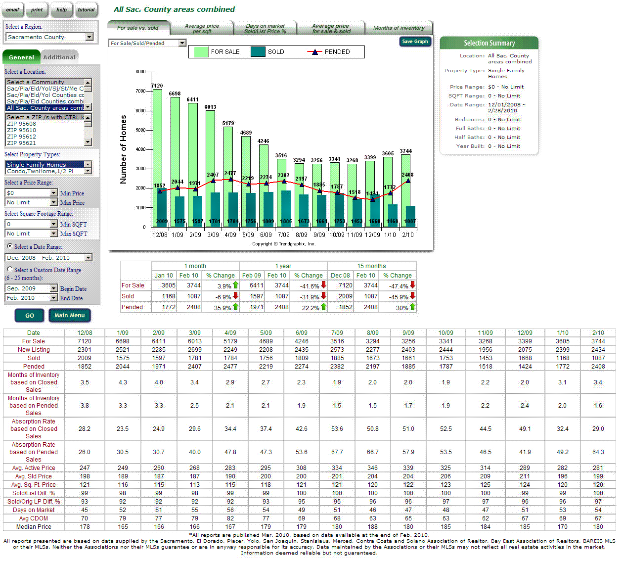
About the For Sale vs. Sold Report The vertical axis represents the number of properties for sale, pended, closed or new listing in a given time period. The horizontal axis represents the monthly trends and changes measured each month. The drop down list in the top-left corner provides the types of the report. The types of the report for For Sale vs. Sold tab are: -> Type 1: For Sale/Sold which shows the number of properties for sale and sold per month.
-> Type 2: For Sale/Sold/Pended which shows the number of properties for sale, pended, and sold per month.
-> Type 3: For Sale/Pended which shows the number of properties for sale and pended per month.
-> Type 4: Sold/Pended which shows the number of properties pended and sold per month.
-> Type 5: For Sale/Sold/Pended/New Listing which shows the number of properties for sale, sold, pended and new listed per month.
-> Type 6: For Sale/New Listing which shows the number of properties for sale and new listed per month.
-> Type 7: For Sale/Sold/New Listing which shows the number of properties for sale, sold and new listed per month.
-> Type 8: For Sale/Pended/New Listing which shows the number of properties for sale, pended and new listed per month.
-> Type 9: Sold/Pended/New Listing which shows the number of properties sold, pended and new listed per month.
-> Type 10: Sold/New Listing which shows the number of properties sold and new listed per month.
-> Type 11: Pended/New Listing which shows the number of properties pended and new listed per month.
Note: If your MLS does not provide the listing date data that is used to specify the new listing numbers, your report has Type 1 thru Type 4 only in the drop down list selection. The light green bar represents the number of properties listed per month based on the selected criterias. The red line with black triangle marks represents the number of properties pended per month based on the selected criterias. The dark green bar represents the number of properties that have closed escrow per month based on the selected criterias. The most recent month's number is preliminary and may be revised in the next month's report. This is to account for closed properties that are reported late. The blue line with black circle marks represents the number of new listed properties per month based on the selected criterias. What do For Sale, Pended, Sold and New Listing mean?
The For Sale numbers are the snapshot of the number of property for sale at the end of the month. What Does For Sale vs. Sold Report Do? It helps determine the trend of market supply and demand. It helps determine whether the current market is a seller or buyer market. It helps determine the minimum length of the listing period. It helps identify which price range the majority of the properties are in, within a given area. It helps focus on where the buyer's activities are and the market condition in those areas. How to Use For Sale vs. Sold Report? Use with Average Price Per Sqft Report to set competitive listing price. Use current inventory level to determine market condition. The current inventory level is derived by dividing the monthly listing number by the monthly sold number which is shown in Months of Inventory graph. As a rule of thumb, an inventory level of less than three indicates a strong seller market while an inventory level greater than six indicates a buyer's market. A download trend of listing inventory and an upward trend of the number of properties sold indicates the seller is in a better negotiating position. An upward trend of listing inventory and a downward trend of the number of properties sold indicates the buyer is in a better negotiating position. You Should Know The properties sold figures are derived from recorded transactions. Current monthly sold figures might be adjusted upward on the next month's report. This is to account for any closed transactions that are reported late. Close Page
Back to Facts & Trends™ Features
Back to top
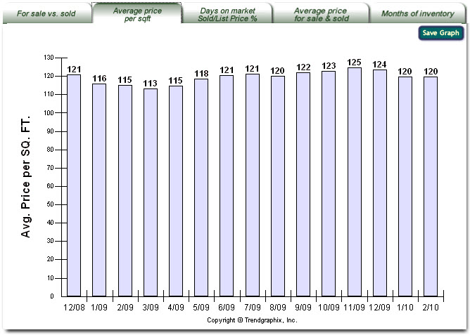
Average Price per Sqft. Report
About the Average Price per Sqft. Report The vertical axis represents the average price per square foot of closed properties in a given time period. The horizontal axis represents the monthly trends and changes measured each month. The purple bar represents the average price per square foot of the closed properties per month based on the selected criterias. How do you calculate the Average Price per Sqft? The Average Price per Sqft is the average of sold price divided by square footage of sold listings. What Does Average Price per Sqft. Report Do? It helps establish the market price for an average home. It helps determine if there is any change in property value for a specific area in a specific price range. How to Use Average Price per Sqft. Report? Use the highest and lowest monthly average price per square foot on the chart to establish the most marketable price range in a specific area. If the home has a larger than normal lot, a special amenity, or is located in an area of social demand, the home price must be adjusted upward. Refer to For Sale vs. Sold Report for the number of properties sold per month. If there are less than five properties sold per month for a specific price range, the average price per square foot might be skewed and is not as useful. In this case, an average of the fifteen month's or more figures should be used in setting the price. You Should Know The garage area is not included in the square footage price calculation. Individual listings in the MLS system without square foot information are excluded in the average square foot price calculation. This report is not available where reporting of property square footage information is prohibited by the local MLS or if you selected Lot and/or Land property types. Close Page
Back to Facts & Trends™ Features
Back to top
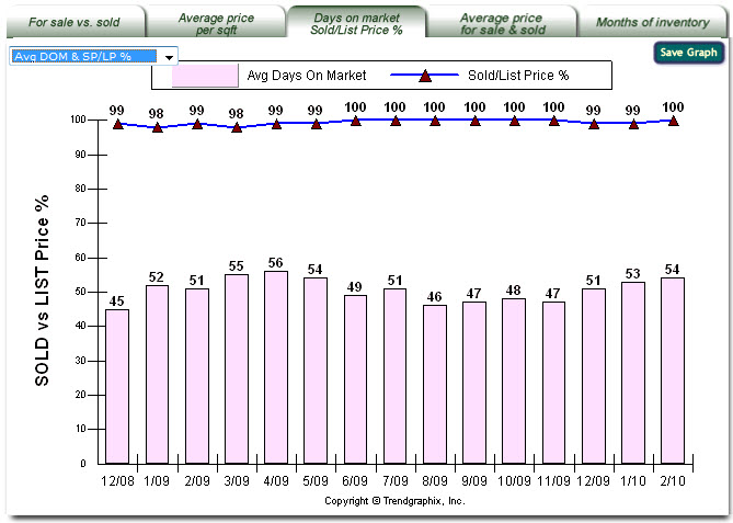
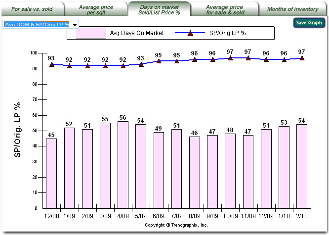
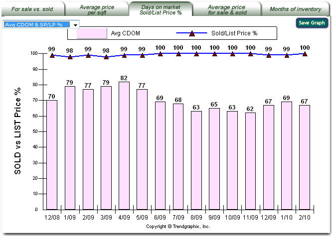
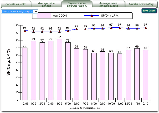
Days on Market and Sold/List Price % Report About the Days on Market and Sold/List Price % Report The vertical axis represents the percentage of the sold price / list price or sold price / original list price of the properties sold in given time period. It also represents average number of days that the house has been on the market (days on market or cummulative days on market). The horizontal axis represents the monthly trends and changes measured each month. The drop down list in the top-left corner provides the types of the report. The types of the report for Days on Market and Sold/List Price % tab are:
The pink bar represents the average number of days that the sold properties had been on the market as active listings before a legal sales contract has been signed (days on market). The dark blue line with the red triangle marks represents the comparison of sold price and list price of the properties sold (sold listings) in percent per month based on the selected criterias. -> Type 2: Avg DOM & SP/Orig LP %
The pink bar represents the average number of days that the sold properties had been on the market as active listings before a legal sales contract has been signed (days on market). The dark blue line with the red triangle marks represents the comparison of sold price and original list price of the properties sold (sold listings) in percent per month based on the selected criterias.
The pink bar represents the average number of days that the sold properties had been on the market as active listings (including if it is relisted) before a legal sales contract has been signed (cummulative days on market). The dark blue line with the red triangle marks represents the comparison of sold price and list price of the properties sold (sold listings) in percent per month based on the selected criterias. -> Type 4: Avg CDOM & SP/Orig LP %
The pink bar represents the average number of days that the sold properties had been on the market as active listings (including if it is relisted) before a legal sales contract has been signed (cummulative days on market). The dark blue line with the red triangle marks represents the comparison of sold price and original list price of the properties sold (sold listings) in percent per month based on the selected criterias. Note: If your MLS does not provide the CDOM data, your report has Type 1 and Type 2 only in the drop down list selection. What is DOM? DOM stands for days on the market, how long a property is on the market. It generally is between the day the property is listed and the day it becomes off market (for example, when it becomes pended). Is Average DOM calculated based on sold listings? Yes, it is. The Average DOM is the average of DOM of sold properties. What is CDOM and how is it calculated? CDOM stands for continuous days on the market and tracks consecutive listing periods. While all MLSs are a little different, the generally accepted rule is that, if a property is re-listed within a 30 day period of it's previous expired, withdrawn, or canceled period, CDOM kicks in and tracks the aggregated listing time of the property. If the property is off the market for 30 days it resets the CDOM. CDOM is usually only measured for a maximum period of two years. If you have questions about how CDOM is calculated in your region, please contact your primary support person for Trendgraphix or speak with a representative for your local MLS. What is Sold/List Diff. %? The Sold/List Diff. % represents the percentage difference between sold price and list price of sold properties. What is Sold/Orig. List Diff. %? When a property is listed on the market, the list price may change couple times before it gets sold. The original list price is the price that is first entered to the MLS database when a property is listed on the market. The Sold/List Diff. % represents the percentage difference between sold price and original list of sold properties. What Does Days on Market and Sold/List Price % Report Do? This report shows the percentage of sold price / list price at which an equal number of properties are sold above, equal or below the list price. It indicates how long it has taken to sell those properties. The percentage of sold price / list price helps identify where the market activity is the strongest. The days on market figure helps establish the minimum listing period. It helps identify the best match for a buyer's price range. How to Use Days on Market and Sold/List Price % Report? If the percentage of sold price / list price is closer to 100 then there are more potential buyers available for the property. If a property's listing period is less than the average days on the market, the listing will have a greater chance of expiring before it is sold. Use this report with out-of-town or relocation buyers to assist then in making their investment decision. Close Page
Back to Facts & Trends™ Features
Back to top
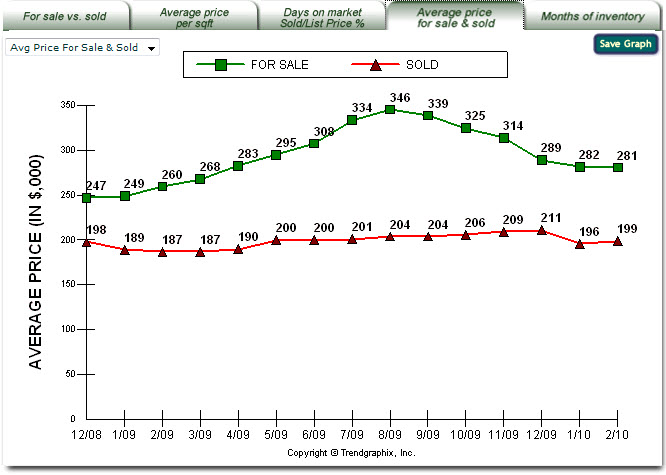
Average Price For Sale & Sold Report About the Average Price For Sale & Sold Report The vertical axis represents the average price of properties that were listed or closed, in thousands, in a given time period. The horizontal axis represents the monthly trends and changes measured each month. The drop down list in the top-left corner provides the types of the report. The types of the report for Average Price For Sale & Sold tab are: -> Type 1: Average Price For Sale & Sold
The green line with the square marks is the average price of active properties listed, in thousands, per month based on the selected criterias The red line with triangles marks is the average price of properties that have closed escrow, in thousands, per month based on the selected criterias
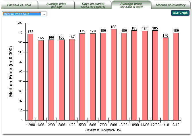
The red bar represents the median price of properties that have closed escrow, in thousands, per month based on the selected criterias. What Does Average Price For Sale & Sold graph mean? The Average Price For Sale is the average of list price of the properties for sale in a particular month. The Average Price Sold is the average of sold price of the properties sold in a particular month. Displaying both the Average Price For Sale and Average Price Sold line charts in a graph portrays the relationship between the on and off market pricing. What Does Average Price For Sale & Sold Report Do? It helps determine whether the market is a buyer or seller market. If the average listing price and average sold price are the closest, the area has the healthiest market. It helps identify where the softest market is and where the buyer can find the biggest price concessions. It helps determine if there is any change in property value for a specific area. How to Use Average Price For Sale & Sold Report? Refer to For Sale vs. Sold Report for the number of properties sold. If a very expensive or very cheap home has been sold, these statistics can be skewed up or down, and the trend line can fluctuate with less consistency. If the average sold price is below the average listing price, and falling, the market is moving toward a buyers' market. If the average sold price trend is up or above the average listing price, the market is moving toward a sellers' market. Close Page
Back to Facts & Trends™ Features
Back to top
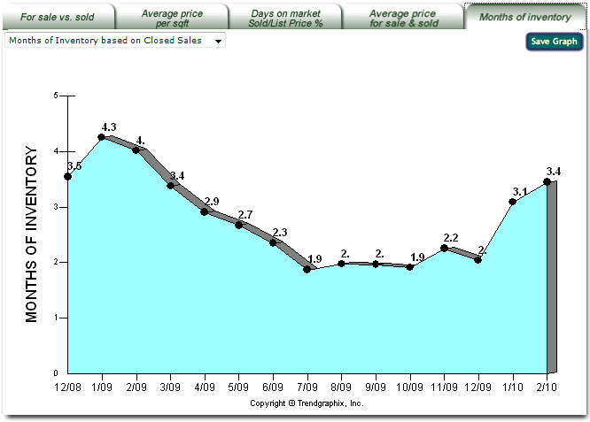
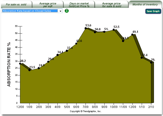
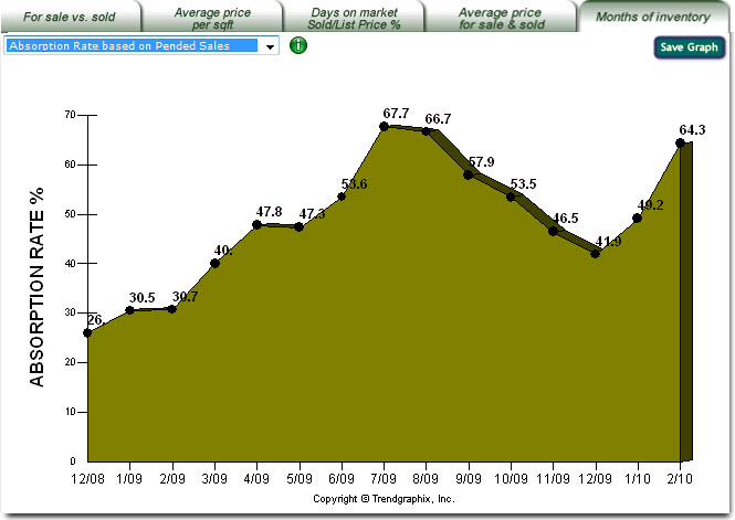
About the Months of Inventory Report The vertical axis represents the months of inventory or absorption rate (in percentage) in given time period. The horizontal axis represents the monthly trends and changes measured each month. There are 2 kinds of Months of Inventory as follows: The drop down list in the top-left corner provides the types of the report. The types of the report for Months of Inventory tab are: -> Type 1: Months of Inventory based on Closed Sales
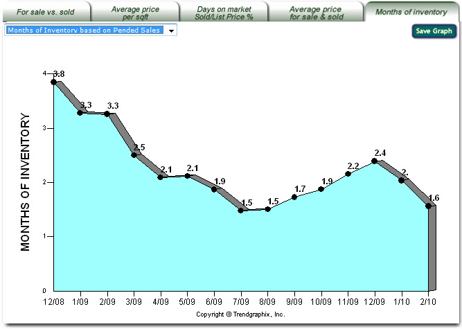
-> Type 2: Months of Inventory based on Pended Sales
-> Type 3: Absorption Rate based on Closed Sales (%)
-> Type 4: Absorption Rate based on Pended Sales (%)
How to Use Months of Inventory Report? Refer to For Sale vs. Sold Report for the number of properties for sale, pended and sold that are used to calculate the Months of Inventory report. As a rule of thumb, an inventory level of less than three indicates a strong seller market while an inventory level greater than six indicates a buyer's market. Close Page
Back to Facts & Trends™ Features
Back to top
There are 5 kinds of graphic reports which correspond to the report tab selection: Graphic Reports 1: For Sale vs. Sold Report which shows the number of properties for sale, pended, sold and new listed graphs. Graphic Reports 2: Average Price per Sqft. Report which shows the average price per square foot of properties sold graph. Graphic Reports 3: Days on Market & Sold/List Price % Report which shows the percentage of sold price / list price (and sold price / original list price) and the average days on market of properties sold (and cummulative days on market) graphs. Graphic Reports 4: Average Price For Sale & Sold Report which shows the average price of property for sale & sold and median sold price graphs. Graphic Reports 5: Months of Inventory Report which shows the months of inventory and absorption rate graphs. Close Page
Back to Facts & Trends™ Features
Back to top
% Change Summary Table summarizes the changes in percentage between the latest month compare to a selected previous month. Close Page
Back to Facts & Trends™ Features
Back to top
This selection summary provides the list of the criterias and their values you have selected. Close Page
Back to Facts & Trends™ Features
Back to top
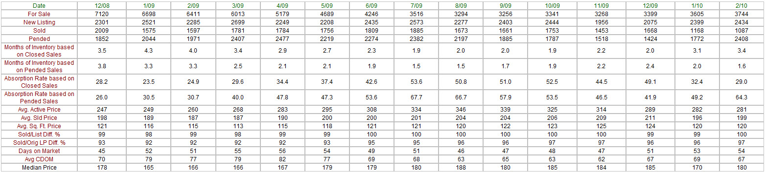
About the Data Table The left column (red text) represents the total of 16 categories that also can be found in the corresponding graphic report. The first row (green text) represents the months of the report. What is the relation between the Data Table and the Graphic Report? Each graphic report has one or more corresponding rows in the data table. The data table rows represent the values, for the x month period (x depends on the date range selection), in each corresponding graphic report. The 16 categories which also can be found in graphic reports are: Category 1: For Sale represents the number of properties for sale (or active listings) per month which also can be found in For Sale vs. Sold graphic report. Category 2: New Listing represents the number of properties new listed per month which also can be found in For Sale/Sold/Pended/New Listing graphic report. Category 3: Sold represents the number of properties sold (or sold listings) per month which also can be found in For Sale vs. Sold graphic report.Category 4: Pended represents the number of properties pended (or pended listings) per month which also can be found in For Sale/Sold/Pended/New Listing graphic report.Category 5: Months of Inventory based on Closed Sales represents the comparison of the number of properties for sale (active listings) and the number of properties sold (sold listings) per month which also can be found in Months of Inventory based on Closed Sales graphic report.Category 6: Months of Inventory based on Pended Sales represents the comparison of the number of properties for sale (active listings) and the number of properties pended (pended listings) per month which also can be found in Months of Inventory based on Pended Sales graphic report.Category 7: Absorption Rate based on Closed Sales represents the comparison of the number of properties for sold (sold listings) and the number of properties sale (active listings) per month which also can be found in Absorption Rate based on Closed Sales graphic report.Category 8: Absorption Rate based on Pended Sales represents the comparison of the number of properties for pended (pended listings) and the number of properties sale (active listings) per month which also can be found in Absorption Rate based on Pended Sales graphic report.Category 9: Average Active Price represents the average price of properties for sale per month, in thousands, which also can be found in Average Price For Sale & Sold graphic report.Category 10: Average Sold Price represents the average price of properties sold per month, in thousands, which also can be found in Average Price For Sale & Sold graphic report.Category 11: Average Square Foot Price represents the average price per square foot of properties sold per month which also can be found in Average Price per Sqft graphic report.Category 12: Sold/List Price Difference in % represents the comparison of the sold price and the list price of the propeties sold in percentage per month which also can be found in Days on Market and Sold/List Price % graphic report.Category 13: Sold/Original List Price Difference in % represents the comparison of the sold price and the original list price of the propeties sold in percentage per month which also can be found in Days on Market and Sold/Orig List Price % graphic report.Category 14: Average Days on Market represents the average days of properties for sale (active listings) becoming pended which also can be found in Days on Market and Sold/List Price % graphic report.Category 15: Average Cummulative Days on Market represents the average days of properties for sale (active listings) becoming pended (including if they are relisted) which also can be found in Cummulative Days on Market and Sold/List Price % graphic report.Category 16: Median Price Sold represents the median price, in thousands, of the sold properties, at which an equal number of properties are sold above or below that price, which also can be found in Median Price Sold graphic report. Median price helps identify where the market activity is the strongest. It helps identify the best match for a buyer's price range. If the property's listing price is closer to the median price then there are more potential buyers available for the property.Close Page
Back to Facts & Trends™ Features
Back to top
|